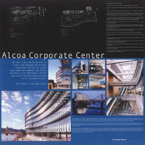
As a precedent for my presentation, I used a poster board from Locus Graphic, which is a company that designs digital presentations for various types of companies. This presentation board is for an architectural firm that designed the Alcoa Corporate Center.
I like the use of two different colors that divides the page into two distinct parts. It does a good job of creating a visual separation between the architectural drawings and the perspectives. I also like the use of the large number of perspectives to explain the building. One of the strengths of Revit is creating perspectives, so this is something I would definitely like to emulate in my presentation. I also like the hierarchy of the perspectives in the way that the different sizes guides the eye in a manner that successfully explains the space.

 RSS Feed